Minty Fresh
Mint green has been coming back into the trend cycle. I’ve seen it in interiors, beauty products, fashion week recaps, etc. It’s having a moment that’s been building in the background of the design industry for a while now.
When most people hear “mint green,” their brain goes somewhere specific.
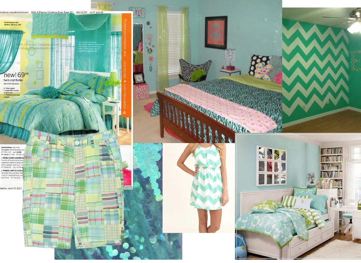
For my generation it’s the 2013 dorm room, that chevron-patterned everything phase that peaked in 2014, or further back in the 2000s, teal and green plaid shorts, Pottery Barn Teen bedrooms, the color of a Benefit Cosmetics bag or your favorite clip-in hair extensions.
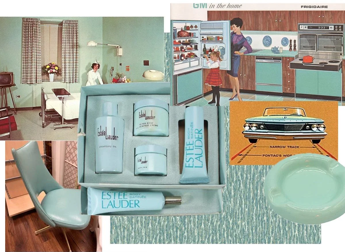
For the generations before me, mint green had lots of other associations. Kitchen appliances, beauty packaging, hospital hallways, control rooms, automobiles, fashion, Miami Vice, the list goes on, but the color always reappears in new and different ways.
Side note - this designer and Substacker has an amazing piece on Why So Many Control Rooms Were Seafoam Green, great read!

So, why does mint keep coming back?
Mint has cycled through American design roughly every decade.
1950s GE, Frigidaire, and Westinghouse produce appliances in pale celadon, marketed as modern and sanitary in the post-WWII American home.
1960s–70s The color appears across automotive, beauty, and interior design, everything from Cadillac exteriors and Estée Lauder beauty packaging.
1980s Interior design adopts full teal on teal, walls and upholstery coordinated, driven by Miami Vice pastel culture.
1990s Charlotte Hornets, Jacksonville Jaguars, and Starter jackets bring the color into sports branding and streetwear; teal is also among the original web-safe colors.
2000s Benefit Cosmetics, Victoria’s Secret Pink, and Y2K accessories carry the color in a synthetic, high-saturation form.
2010s Chevron prints, Pottery Barn Teen, Target and fast fashion pastels revive it before overexposure kills it again.
2026 WGSN codes it Jelly Mint (078-80-22) and names it a Key Color for SS26.
Each cycle oversaturates the color, it recedes, and then inevitably returns in a new way.
So what will this next mint revival look like? Will it be as cringe as the 2000s or something modern and new?
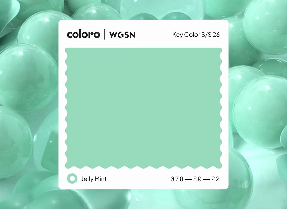
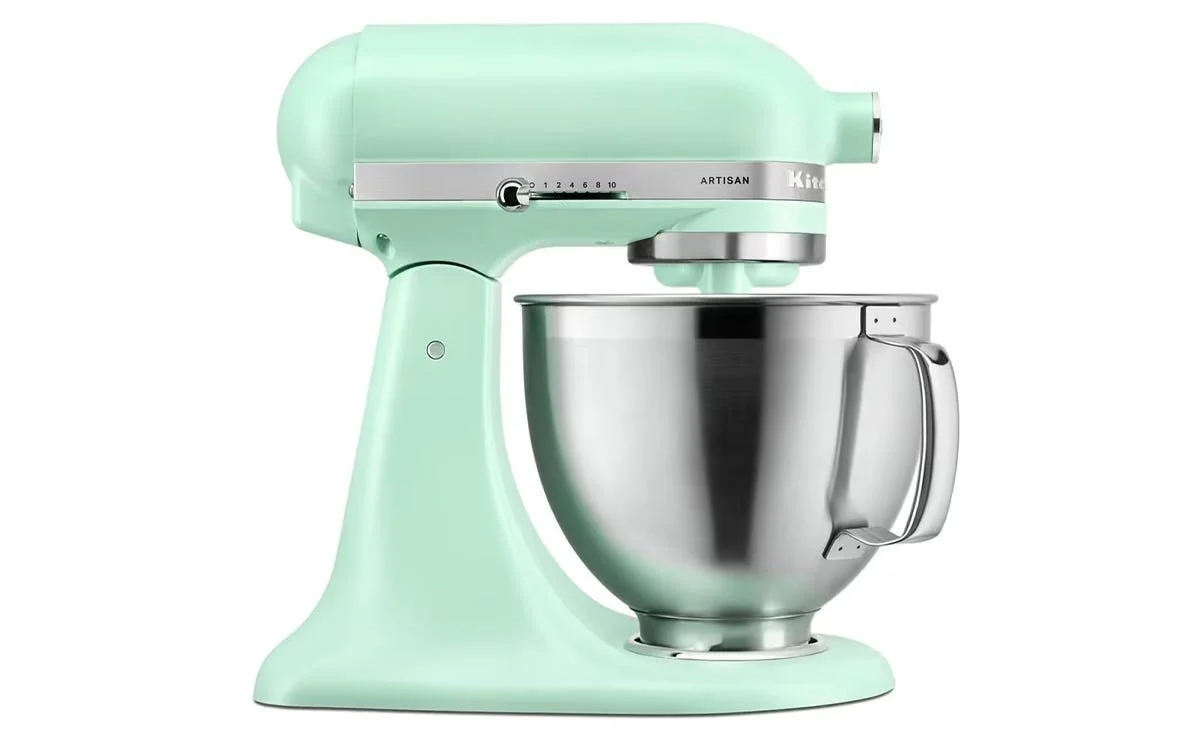
WGSN describes it as “nostalgic and playful”, while KitchenAid uses words like “crisp, calm, and uplifting.” Either way, may brands are having fun with this mint revival.
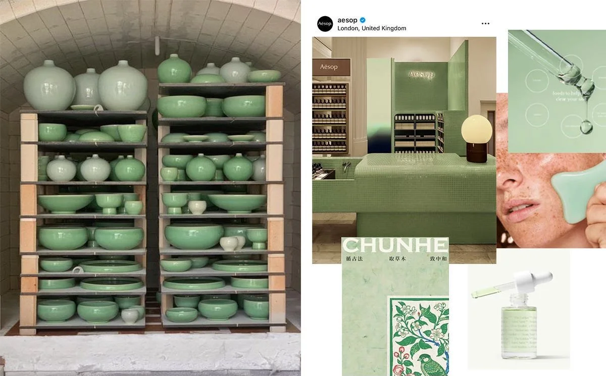
What stands out in this latest iteration is the wellness angle. The color sits naturally within a hyper-modern wellness aesthetic, clean, cool, and relaxing. That is not entirely new, historically this color tone was known as celadon, an ancient Chinese glaze technique where the color was considered precious and associated with calm. What is new is that the design industry leaning into that origin. Previous cycles of mint were about fun, nostalgia, or domesticity. This one feels more inline with restorative qualities of the color.
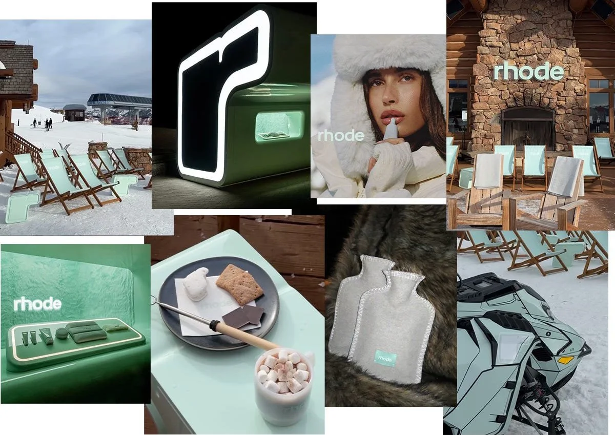
Rhode is a perfect example of wellness meeting modern, with an added layer of Y2K nostalgia. The brand taps into a calm, clean feeling while playing into 2000s references through typography and branding. Their Snow Club activation at Big Sky, Montana this February was a masterclass in world building. It perfectly sold a minty clean aesthetic centered around a refreshing, neon tone that anchored the entire campaign.
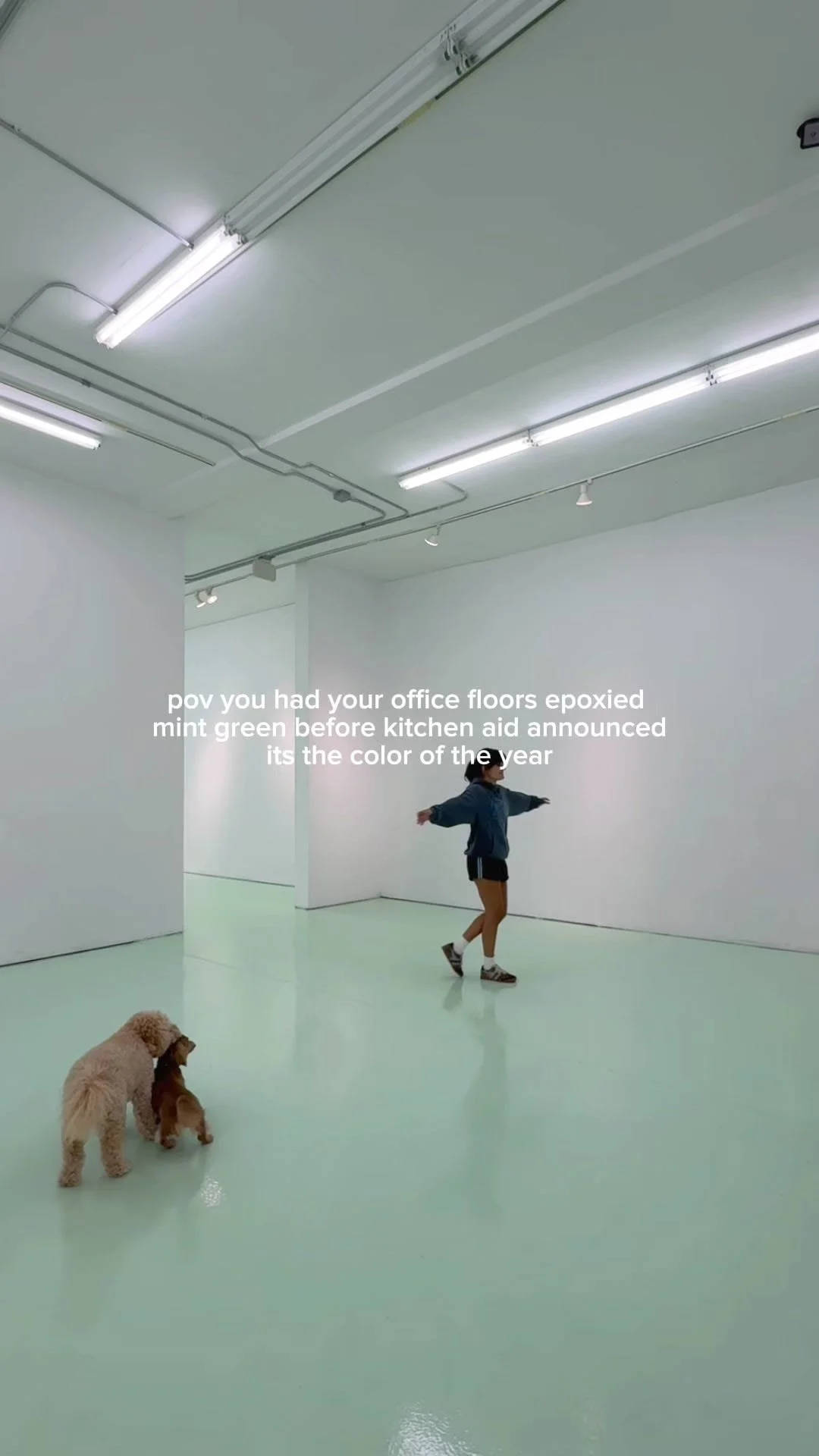
Meanwhile, on TikTok, popular design influencers like @daniklar are using this color in interiors and branded spaces. Dani summed it up simply: “I’ve said this once and I’ll say it again — mint green is so in 🧚🌷.” The comments agreed.
How to use it in your interiors
The good news for interiors is that mint is one of the most versatile colors in the spectrum. It reads differently depending on what you put it next to, and it works across multiple design languages.
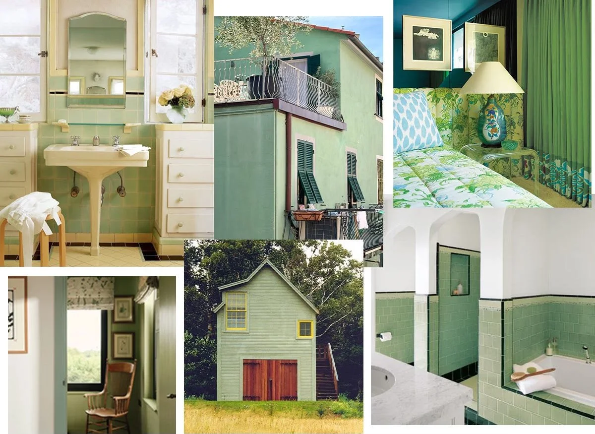
The traditional approach leans into its history. I think of Southern interior design aesthetics as well as Mediterranean architecture and historic interiors. Last summer in Italy I noticed it on buildings and interior walls, where it reads as refreshing and light against warmer tones. Pair it with natural linens, yellows, warm red woods, and upbeat florals. This recently renovated Auberge also uses teal in a very traditional way throughout their design, calling back to classic Southern aesthetics using mint.
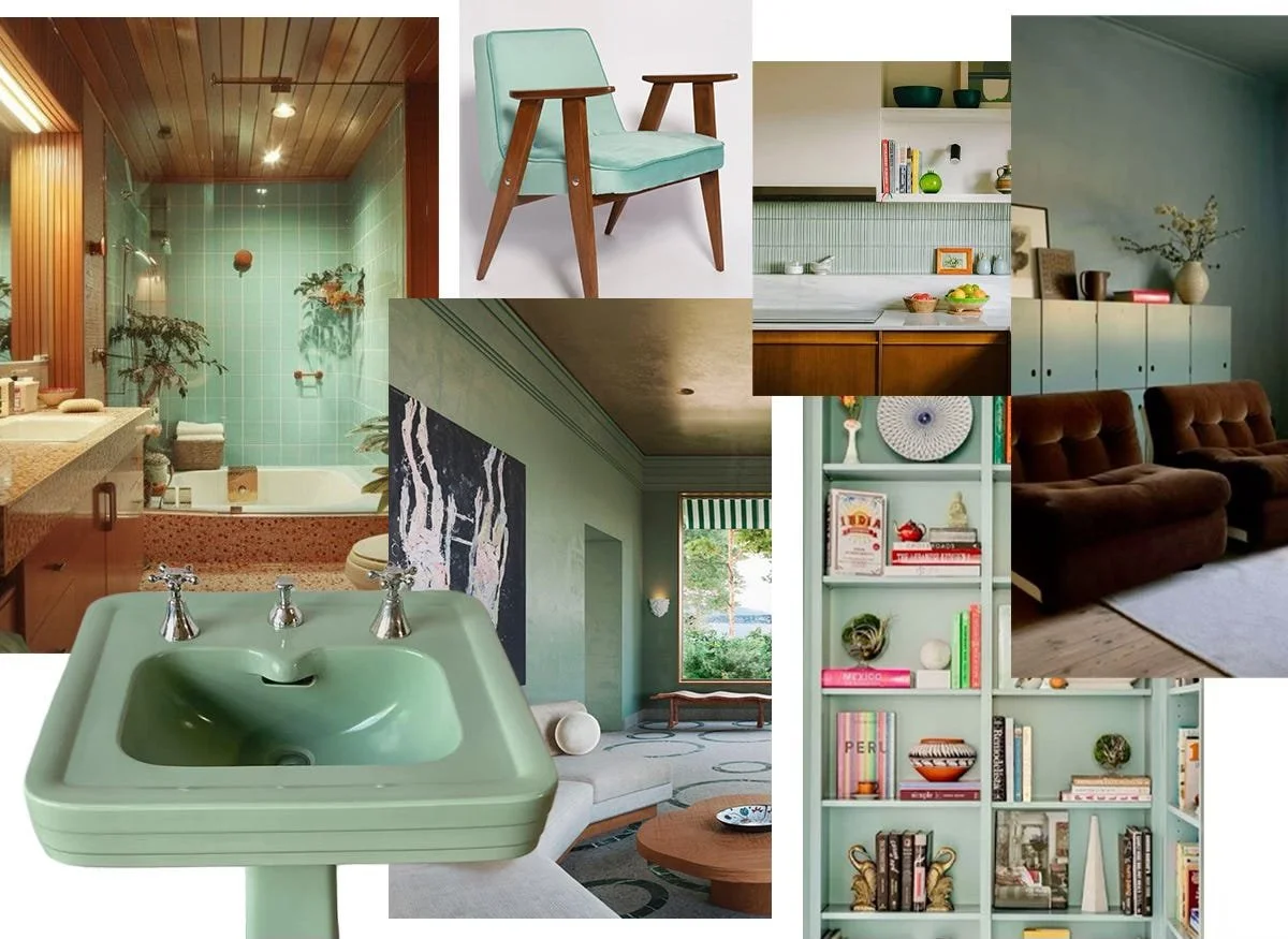
The mid-century approach is where it gets fun. This era was known for mint tones and pairs well with Eames silhouettes, walnut wood tones, and clean-lined cabinetry. The key here is keeping it company with warm neutrals and woods.
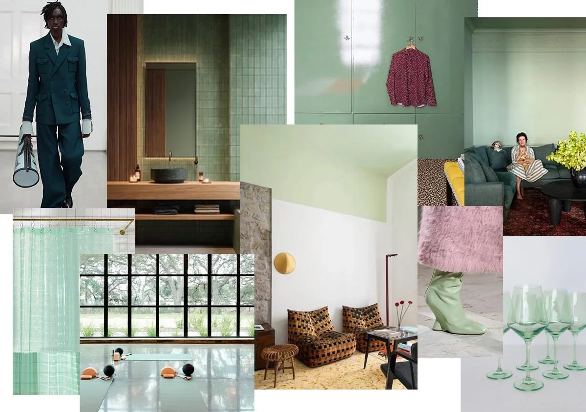
The contemporary approach is more textured and tactile. Glass vessels, iridescent glazes, resin objects. The color in a form that lets light move through it. This is the version that feels most of-the-moment and also the most interesting to watch develop in product design over the next year.
Interested to see where this trend goes.. let me know your own thoughts in the comments!